Does this require my own dataset?
No. The current mode is designed to generate the visual analysis directly from the selected urban context.
Urban Data Layers add a data-art visual language to architectural site analysis. Generate node-based station maps or grid heat layers directly from the selected urban context, with dark basemaps, high-contrast markers and summary statistics.
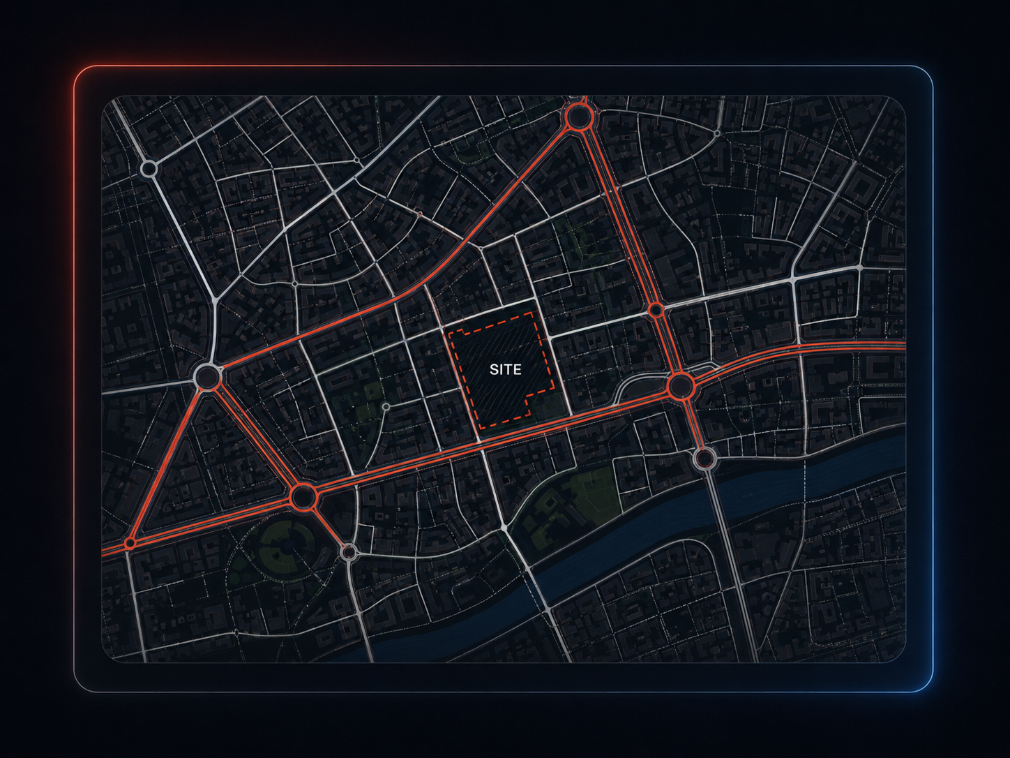
Use layered circles and point sizes to express spatial intensity, clustering and station-style urban patterns.
Divide the context into cells and map intensity through colour and transparency for a fast density reading.
The goal is not manual plotting. Select the site and generate a visually coherent urban-data graphic directly.
Choose the same site used for the rest of the architecture analysis.
Use Nodes / Stations for point distribution or Grid / Heat for cell-based intensity.
Regenerate variations, choose a colour treatment and export the diagram with the rest of the analysis set.
No. The current mode is designed to generate the visual analysis directly from the selected urban context.
The feature is primarily an architectural visual-analysis layer rather than a claim of survey-grade transport statistics.
Yes. The integrated analysis cards provide colour and randomisation controls.
Yes. It is integrated into the Site Analysis workflow rather than being a separate standalone tool.